
The Ms. Megaton Man™ Maxi-Series! The original Megaton Man and Bizarre Heroes comics and stories, retold as an underground prose novel by Ms. Megaton Man herself, Clarissa James (transcribed by Don Simpson)! New chapter every Friday, 10:30 am EST.
Showing posts with label art. Show all posts
Showing posts with label art. Show all posts
Friday, December 10, 2021
#146: Megatron Man #1
“Chase Bradford’s comic book has been published? By a real publisher? That’s wonderful,” I said. I had seen much of the original artwork while he was working on it, but being busy with grad school myself, hadn’t been in touch with the aspiring cartoonist in quite a while. “How do you know, Nancy? Have you seen it?”

Tuesday, June 26, 2018
Clarissa's Cameo: Ms. Megaton Man's King Kong Easter Egg!
Clarissa's Covered-Up Cameo! Plus: Ann's Problematic Panties!
Clarissa James (or a look-alike) made a cameo appearance in the 1991 adaptation of King Kong, specifically in the fifth issue (Monster Comics/Fantagraphics Books, November 1991) of the six-issue series. In that unfairly forgotten graphic novel, I wrote and drew the story as it originally appeared in the novelization of the screenplay, which included scenes routinely cut out by both movie theaters and TV stations. Among these is the short scene of Kong's rampage through the native village in which the giant ape stomps and chews on stock extras, and a native girl is stampeded by a dinosaur.
My Clarissa look-alike (showing my limited range of ethnic types) was drafted to play the role of the native girl. What is interesting is that, whereas I initially depicted her partially nude, as per the setting and milieu of the story, the Fantagraphics editors, nervous of the licensee, insisted that I give her a more modest top. I ultimately complied; although I drew the line at showing the triceratops ramming her through her abdomen with his horn (which may or may not have been in the original story).
(I may have considered this last narrative wrinkle on my own, although I clearly could not bring myself to doing such violence to such a beautiful figure).
The changes in the published comic book, compared to file photocopies I recently unearthed, seem utterly trivial in retrospect, particularly for a black and white comic book the publisher failed to promote, and by the fifth issue, few readers were following (the strategy of serializing King Kong over a year or more, when everyone already knew how the story ended, was an abysmally poor marketing choice).
Even more meddlesome were the changes deemed necessary to Ann Darrow's panties in three panels of the same issue, after she loses the last shreds of her dress on Monster Isle (in issue #4, she was stripped of her garments by Kong, and subsequently survived a high-dive into water from a steep cliff; how she was even breathing at this point stretched credulity).
Ann, a dead ringer for my character Stella Starlight (the limitations of my stock characters showing once again) was known for "turning herself naked with but a thought" as the See-Thru Girl (she was not yet known as the more chaste and upright Earth Mother).
In comparison to file photocopies, it would seem I added less than an inch of fabric to Ann's backside, obscuring her crack somewhat, but otherwise accomplishing little either aesthetically or in improving the narrative.
Kong is nothing if not a profoundly erotic work of escapism, and these trivial changes show Fantagraphics to be a bunch of nervous ninnies as bad or worse as the big, corporate comics publishers when it comes to well-known trademarks. (Ironically, the same company that was publishing King Kong under its Monster Comics imprint were publishing my graphically explicit Anton Drek comics - which it proudly marketed as "the filthiest, most controversial sex comics of the twentieth century" - under their Eros Comix imprint.
The difference between Puritanism and prurience in comics is razor-thin (in my case, depending only on which name I sign to a piece of figurative cartooning), but the discretions and indiscretions of early 1990s comics seemed just as bizarrely anachronistic at the time as the certainly do now. Why a native girl in the south seas, or a white goddess stripped of her garments by a giant ape, would be anything other than completely nude in such a primeval adventure of the id seems implausible.
King Kong may be the most meddled-with story in the annals of American pop imagery, no doubt because of its deep-seated (and regressive) views of sexuality, gender roles, and race. Like the work of Edgar Rice Burroughs and Philip Jose Farmer, Kong will always occupy an iconic space somewhere between escapist daydream and erotic yearning, causing artists, filmmakers, and others attempting to interpret this story no end of silly revisions, redactions, rewrites, and bowdlerizations.
The 1991 graphic adaptation of King Kong was based solely upon the original 1932 book by Edgar Wallace, Merian C. Cooper, and Delos W. Lovelace and is in no way related to or derived from any motion-picture version of the same. The artwork is © 1991 Don Simpson and Richard Merian Cooper, all rights reserved. Used with permission.
Visit the All-New Don Simpson's King Kong Blog!
Clarissa James (or a look-alike) made a cameo appearance in the 1991 adaptation of King Kong, specifically in the fifth issue (Monster Comics/Fantagraphics Books, November 1991) of the six-issue series. In that unfairly forgotten graphic novel, I wrote and drew the story as it originally appeared in the novelization of the screenplay, which included scenes routinely cut out by both movie theaters and TV stations. Among these is the short scene of Kong's rampage through the native village in which the giant ape stomps and chews on stock extras, and a native girl is stampeded by a dinosaur.
 |
| The original art of Kong's native village rampage, from a file photocopy. |
My Clarissa look-alike (showing my limited range of ethnic types) was drafted to play the role of the native girl. What is interesting is that, whereas I initially depicted her partially nude, as per the setting and milieu of the story, the Fantagraphics editors, nervous of the licensee, insisted that I give her a more modest top. I ultimately complied; although I drew the line at showing the triceratops ramming her through her abdomen with his horn (which may or may not have been in the original story).
 |
| Dot screens are never enough: the bare torso of the original figure. |
(I may have considered this last narrative wrinkle on my own, although I clearly could not bring myself to doing such violence to such a beautiful figure).
 |
| The nervous editors made me put a strip of clothe over her chest, but I drew the line at actually depicting her gruesome death by being impaled on a triceratops horn. |
The changes in the published comic book, compared to file photocopies I recently unearthed, seem utterly trivial in retrospect, particularly for a black and white comic book the publisher failed to promote, and by the fifth issue, few readers were following (the strategy of serializing King Kong over a year or more, when everyone already knew how the story ended, was an abysmally poor marketing choice).
 |
| Here is the original art next to the censored, published version. |
Even more meddlesome were the changes deemed necessary to Ann Darrow's panties in three panels of the same issue, after she loses the last shreds of her dress on Monster Isle (in issue #4, she was stripped of her garments by Kong, and subsequently survived a high-dive into water from a steep cliff; how she was even breathing at this point stretched credulity).
Ann, a dead ringer for my character Stella Starlight (the limitations of my stock characters showing once again) was known for "turning herself naked with but a thought" as the See-Thru Girl (she was not yet known as the more chaste and upright Earth Mother).
In comparison to file photocopies, it would seem I added less than an inch of fabric to Ann's backside, obscuring her crack somewhat, but otherwise accomplishing little either aesthetically or in improving the narrative.
 | |
| Adding an inch of fabric and smoothing out the soaking-wet wrinkles made Ann Darrow's derriere suitable for 1990s comic book audiences. |
Kong is nothing if not a profoundly erotic work of escapism, and these trivial changes show Fantagraphics to be a bunch of nervous ninnies as bad or worse as the big, corporate comics publishers when it comes to well-known trademarks. (Ironically, the same company that was publishing King Kong under its Monster Comics imprint were publishing my graphically explicit Anton Drek comics - which it proudly marketed as "the filthiest, most controversial sex comics of the twentieth century" - under their Eros Comix imprint.
 |
| A giant ape charges the crew of the intrepid steamer. It's in situations like this a girl wants to be modestly attired. |
The difference between Puritanism and prurience in comics is razor-thin (in my case, depending only on which name I sign to a piece of figurative cartooning), but the discretions and indiscretions of early 1990s comics seemed just as bizarrely anachronistic at the time as the certainly do now. Why a native girl in the south seas, or a white goddess stripped of her garments by a giant ape, would be anything other than completely nude in such a primeval adventure of the id seems implausible.
 |
| Ann says goodbye to Monster Isle; back in New York, she'll have to wear an evening gown again! |
King Kong may be the most meddled-with story in the annals of American pop imagery, no doubt because of its deep-seated (and regressive) views of sexuality, gender roles, and race. Like the work of Edgar Rice Burroughs and Philip Jose Farmer, Kong will always occupy an iconic space somewhere between escapist daydream and erotic yearning, causing artists, filmmakers, and others attempting to interpret this story no end of silly revisions, redactions, rewrites, and bowdlerizations.
The 1991 graphic adaptation of King Kong was based solely upon the original 1932 book by Edgar Wallace, Merian C. Cooper, and Delos W. Lovelace and is in no way related to or derived from any motion-picture version of the same. The artwork is © 1991 Don Simpson and Richard Merian Cooper, all rights reserved. Used with permission.
Visit the All-New Don Simpson's King Kong Blog!
Saturday, June 16, 2018
Dandy Demo: A Workshop Wonder
For years I ran a cartooning workshop in Pittsburgh, mostly at the Community College of Allegheny County and Pittsburgh Center for the Arts, but also at Sweetwater and the Carnegie Museum of Art. These character poses, of Gower Goose and Megaton Man, respectively, are from a demonstration piece I did in one workshop, probably around 2000. I scanned it and colored it digitally in 2018.
[I belatedly realize I should have posted this to my Megaton Man™ blog, but it's too much trouble to change it over at this point! Oh, well, Clarissa can use the traffic.]
 |
| Megaton Man and Gower Goose! |
 |
| The original 14" x 17" sheet of Bristol board. I would improvise such demonstration pieces on the spot, and they would turn out only slightly less coherent than my more planned-out work! |
Thursday, June 14, 2018
Greetings from Warhead Beach: A Swimsuit Postcard Pin-Up!
Back in the roaring 80s, a fanzine called Amazing Heroes published an annual swimsuit issue edited by the late Mr. Kim Thompson, one of the founders, along with Gary Groth, of Fantagraphics Books.
In 1990, the cast of Megaton Man™, including our very own Ms. Megaton Man, Clarissa James, took their turn for some fun and sun. The original, printed in gritty black and white on newsprint, has been colorized for the 21st century!
A limited-edition 11" x 17" print of this piece will be coming to NEO Con 2018 in Olmsted, Ohio, August 19, and you'll be able to get yours autographed by Don Simpson!
Note: There was also a Border Worlds™ pin-up that will be coming to blog near you soon!
Stella Starlight™, Tad ‘n’ Rover™, Yarn Man™, Clarissa James™, Partyers from Mars™ and other characters Megaton Man™ and © Don Simpson 2018, all rights reserved.
 |
| The newly-colorized postcard version! |
In 1990, the cast of Megaton Man™, including our very own Ms. Megaton Man, Clarissa James, took their turn for some fun and sun. The original, printed in gritty black and white on newsprint, has been colorized for the 21st century!
A limited-edition 11" x 17" print of this piece will be coming to NEO Con 2018 in Olmsted, Ohio, August 19, and you'll be able to get yours autographed by Don Simpson!
 |
| The original: pen, brush and ink with dot screen on Bristol board. |
Note: There was also a Border Worlds™ pin-up that will be coming to blog near you soon!
Stella Starlight™, Tad ‘n’ Rover™, Yarn Man™, Clarissa James™, Partyers from Mars™ and other characters Megaton Man™ and © Don Simpson 2018, all rights reserved.
Monday, August 17, 2015
Points from the Paint: Clarissa vs. Fanny!
Here is a couple of unpublished pages from c. 1993 featuring Clarissa James (Ms. Megaton Man) and Donna Blank, the Phantom Jungle Girl, shooting some hoops on some suburban driveway. This sequence was intended to be a part of Bizarre Heroes, and I don't know why I was too lazy to ink the sparse backgrounds and finish them up (including the last panel with Jasper Johnson, Rubber Brother). This scene offers some important backstory to the Phantom Jungle Girl and her historical origins and I still may use it as a flashback scene in some future project.
What is unusual about these pages is that they are largely inked with a Hunt #102 crowquill pen and some brush on plate finish Bristol, which inks a lot smoother than the usual medium surface Bristol I used with brush. It is also significant that my female characters tended toward more realistic proportions much earlier than my male characters. Prior to this, I tended to make everyone cartoony so as to match the unwieldy proportions of Megaton Man, a tension that I struggled with for far too long. One of the reasons I always found some release in drawing Ms. Megaton Man was precisely this release from the feeling that everything in the Megaton Man narrative had to appear exaggerated and humorous. By this time I was growing comfortable with the idea that things could be light and humorous (and character-driven instead of parody-driven), and drawn in a less forced way.


What is unusual about these pages is that they are largely inked with a Hunt #102 crowquill pen and some brush on plate finish Bristol, which inks a lot smoother than the usual medium surface Bristol I used with brush. It is also significant that my female characters tended toward more realistic proportions much earlier than my male characters. Prior to this, I tended to make everyone cartoony so as to match the unwieldy proportions of Megaton Man, a tension that I struggled with for far too long. One of the reasons I always found some release in drawing Ms. Megaton Man was precisely this release from the feeling that everything in the Megaton Man narrative had to appear exaggerated and humorous. By this time I was growing comfortable with the idea that things could be light and humorous (and character-driven instead of parody-driven), and drawn in a less forced way.


Saturday, April 4, 2015
Sketchbook Spring Training!
First inking of the spring (a bit rusty)...!
.JPG)

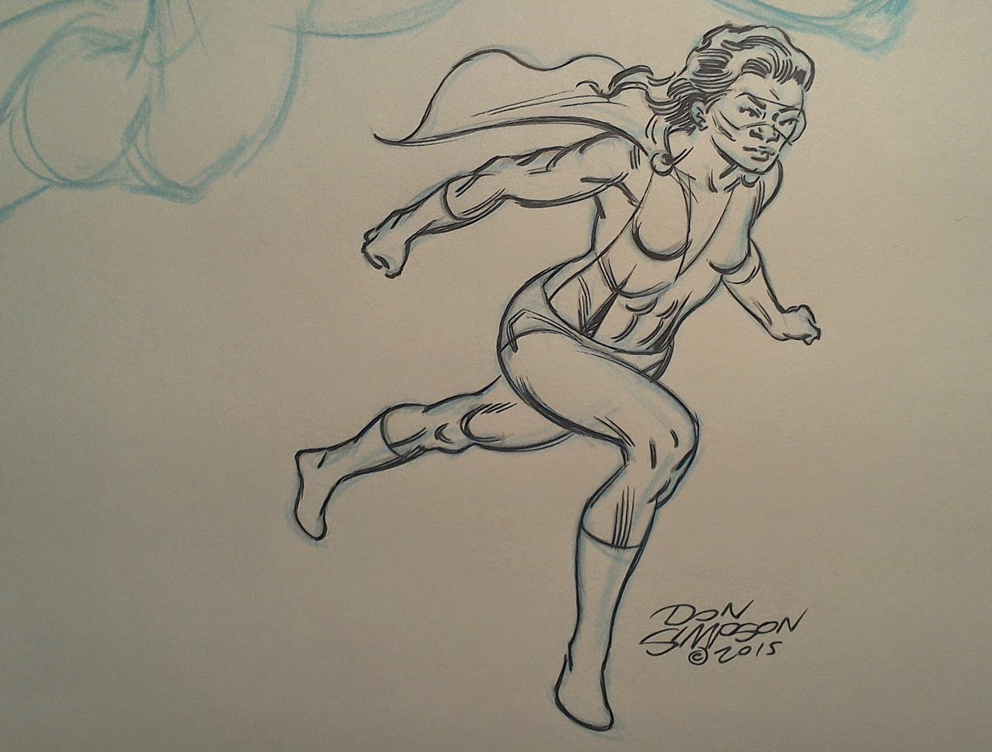

The top sketch is mostly Hunt #102 crowquill; the bottom three are Sharpie Pen (non-permanent).
Friday, June 13, 2014
Clarissa vs. the Big Two! Plus: Yarn Man!
Updated June 6, 2014.
This colored greyline with linework on an acetate overlay would have been the cover to a one-shot issue of Ms. Megaton Man. Announced in Yarn Man #1 (1989) as “Coming in April” of that year, the cover was used in a full-page house ad with a Kitchen Sink Press logo. After severing ties with that imprint, I embarked on Don Simpson’s Bizarre Heroes through my own imprint, Fiasco Comics, which ran for 17 issues in 1994-1995. It was at that time that I colored this piece of art, and was contemplating an entire issue devoted to Clarissa James at that time.
This colored greyline with linework on an acetate overlay would have been the cover to a one-shot issue of Ms. Megaton Man. Announced in Yarn Man #1 (1989) as “Coming in April” of that year, the cover was used in a full-page house ad with a Kitchen Sink Press logo. After severing ties with that imprint, I embarked on Don Simpson’s Bizarre Heroes through my own imprint, Fiasco Comics, which ran for 17 issues in 1994-1995. It was at that time that I colored this piece of art, and was contemplating an entire issue devoted to Clarissa James at that time.
 |
| Cover to Ms. Megaton Man #1, Cel-Vinyl paints on greyline with acetate linework overlay (unpublished), c. 1995. |
The basic composition for the cover had originally been
worked out as a Supergirl sample for
DC Comics. I have a photocopy of the original layout somewhere in my files, but I
can’t recall whether I ever finished the artwork for it or not; if I did, I may have
sold it off at a convention. In any case, I always liked the composition, which
is why I reworked it as a Ms. Megaton Man piece. It also further underscores
the fact Ms. Megaton Man, although originally a female variation on the more
decidedly humorous Megaton Man, always had a more dramatic side, and to my mind
could conceivably work as a plausibly dramatic megahero.
Although the issue never appeared, and frankly I can't recall having much of a plotline in mind beyond the futuristic War of the Worlds image, I am currently devising a storyline that will involve Ms. Megaton Man traveling to the future and battling the Big Two. What is remarkable about the image, even today, and about Ms. Megaton Man in general, is that she heralded a more realistic superhero style for me that was way ahead of its time in the late 1980s. Drawing the Megaton Man supporting cast always presented a problem for me (should they be drawn in a humorous or more realistic fashion?), and Ms. Megaton Man showed me that I could blend a satirical style with a more straight approach (and by utilizing the Megaton Man costume, no less).
Although the issue never appeared, and frankly I can't recall having much of a plotline in mind beyond the futuristic War of the Worlds image, I am currently devising a storyline that will involve Ms. Megaton Man traveling to the future and battling the Big Two. What is remarkable about the image, even today, and about Ms. Megaton Man in general, is that she heralded a more realistic superhero style for me that was way ahead of its time in the late 1980s. Drawing the Megaton Man supporting cast always presented a problem for me (should they be drawn in a humorous or more realistic fashion?), and Ms. Megaton Man showed me that I could blend a satirical style with a more straight approach (and by utilizing the Megaton Man costume, no less).
 |
| House ad for Ms. Megaton Man #1, a projected one-shot that was never published, from Yarn Man #1 (1989), a one-shot that was. |
Speaking of Yarn Man, below is the original acrylic painting
for Yarn Man #1, the only cover I
ever fully painted. I have worked with oils, acrylics, gouache, watercolor,
Cel-Vinyl, and digital coloring for a variety of pieces, ranging from personal
studies to professional work, but I have found acrylics to be the most
difficult medium with which to paint. In fact, unless one specifically wanted
to create some wall-sized abstract sofa art (which I’ve done for my own
gratification), I’m not sure why anyone would find acrylics useful. But that’s
just me.
 |
| Cover of Yarn Man #1, original acrylic painting on illustration board, 12.5" x 18". |
 |
| Cover of Yarn Man #1 (Kitchen Sink Press, 1989) as published. |
Sunday, May 11, 2014
Sandball Goddess: Some Art Historical Swiping
Just to show that I'm not always swiping from my old sketchbooks, here I am swiping from art history. In fact, when I taught a class in art history last fall at Carlow University, I realized that the work I was swiping (a sculpture from a niche at CMU) was actually a swipe of a specific figure from a famous temple in India:
What is interesting is that the first figure appears to be grinding makeup, while the CMU adaptation has the same figure doing something more scholarly, presumably writing on a notepad or book of some sort. I'm not sure what Clarissa is doing; perhaps jotting down a play for competition. I'd like to do a complete comic book someday that is nothing but swipes from various art historical sources, and let readers guess where each is from.
 |
| Erotic figures, Kandariya Mahadeva Temple, Khajuraho, Madhya Pradesh, India, c. 1000 CE. Chandella dynasty. |
 |
| Scribe figure, Fine Arts Building, Carnegie Mellon University, Pittsburgh (my photograph). |
 |
| Clarissa in beach volleyball attire, sketchbook drawing, c. 2010. |
Monday, July 8, 2013
The Ms. Megaton Man Story: Told in Pictures and Panels
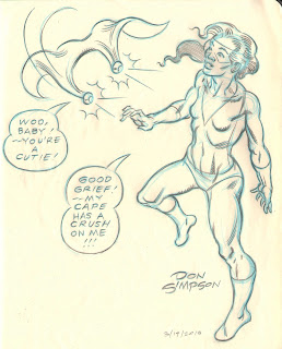
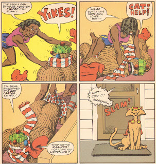
This blog is under construction, but for the time being, here are some pictures to look at:






Subscribe to:
Posts (Atom)